Website Review

Website Feedback & Recommendations
Constructive feedback and suggestions to elevate the Go Do Good digital experience.
Constructive feedback and suggestions to elevate the Go Do Good digital experience.
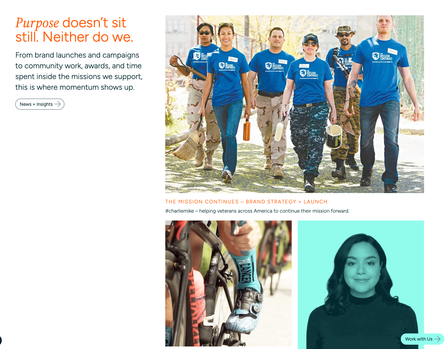
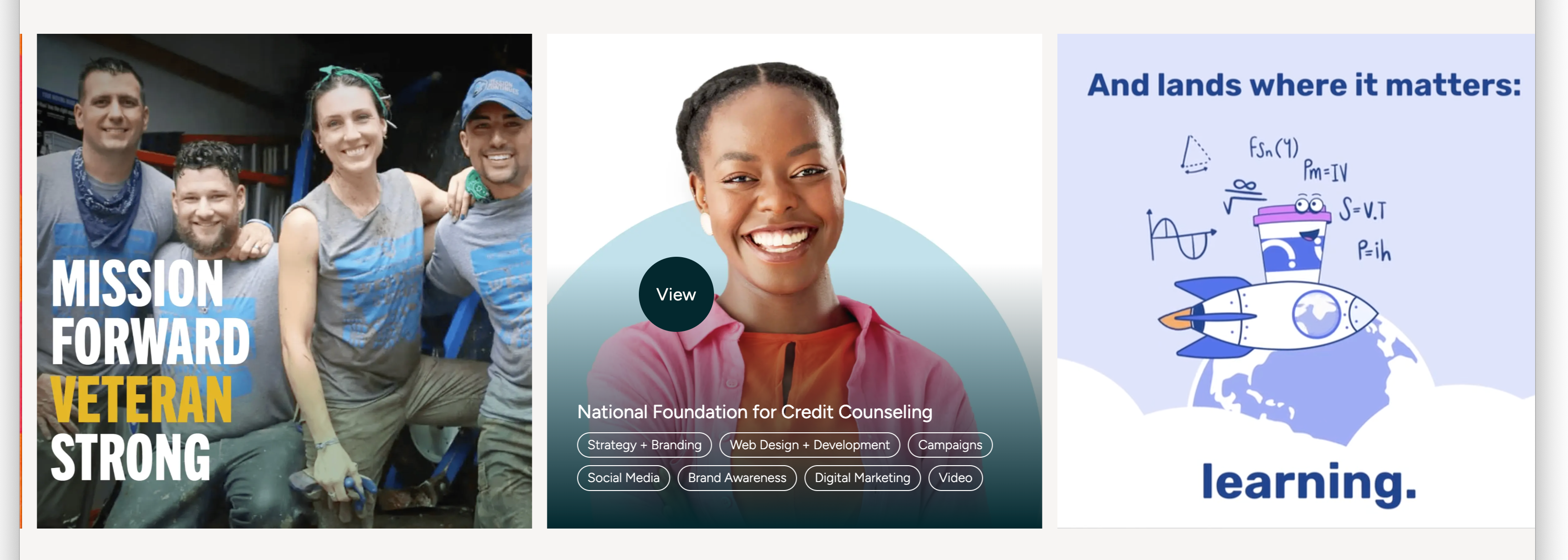
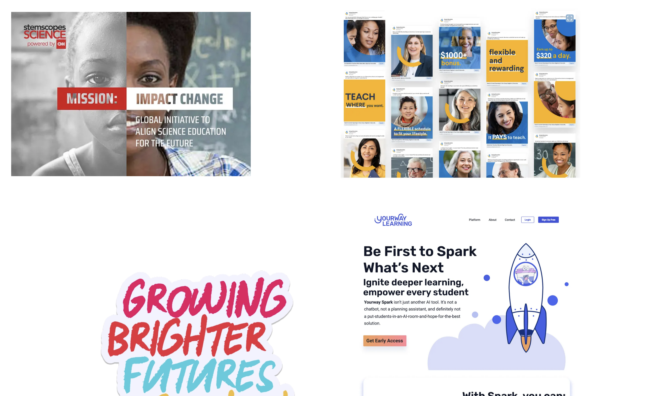
The Go Do Good site is in strong shape and does a great job communicating the brand's mission and personality. The dark teal palette, clean navigation, and bold typography create a professional, grounded feel that works well for the nonprofit and purpose-driven space. The variety of work on display is impressive, and the mix of community photography with design deliverables gives the site real depth. These suggestions are focused refinements to tighten the experience, improve clarity around the process, and make the calls to action work harder for new business.
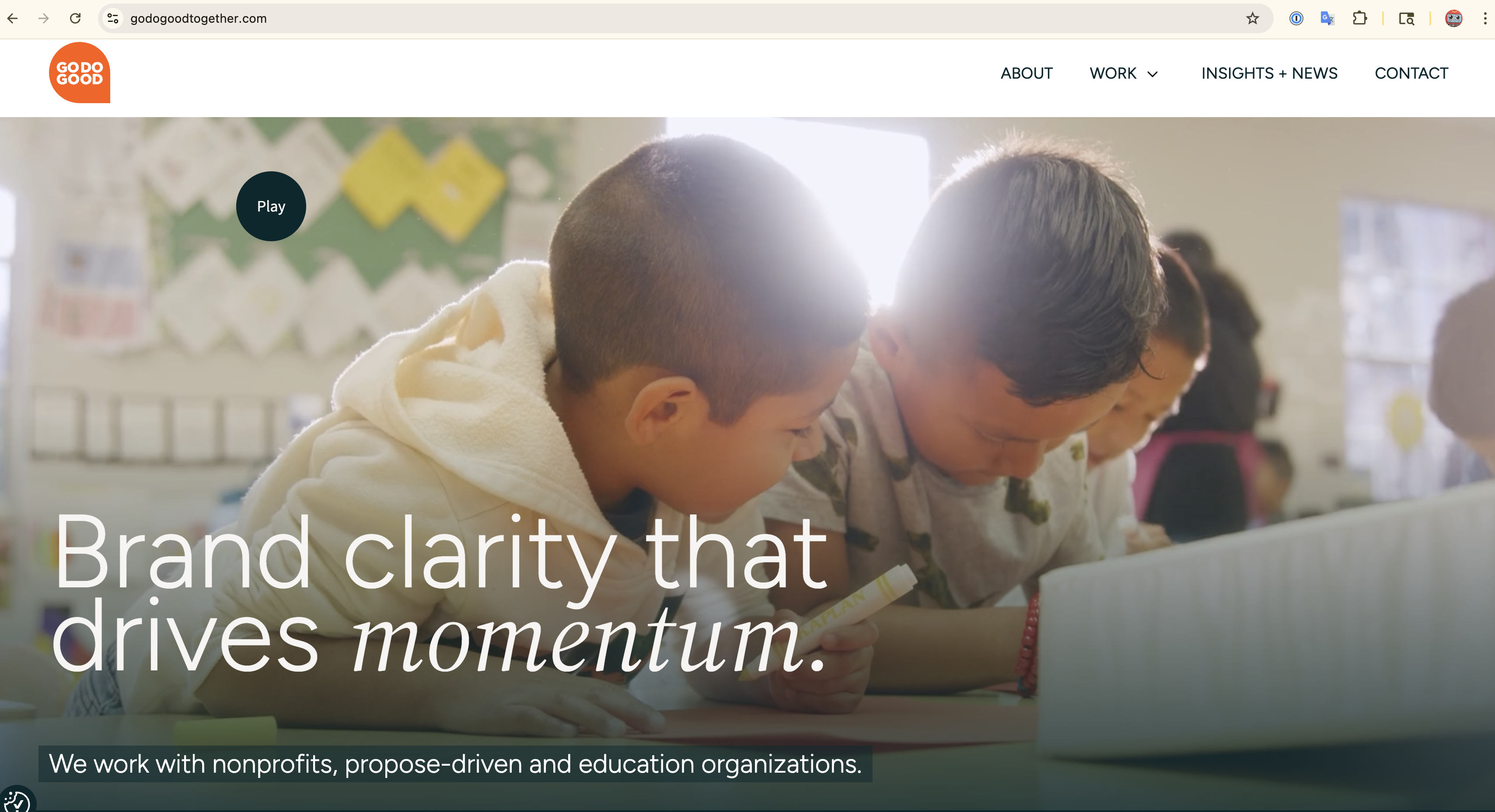
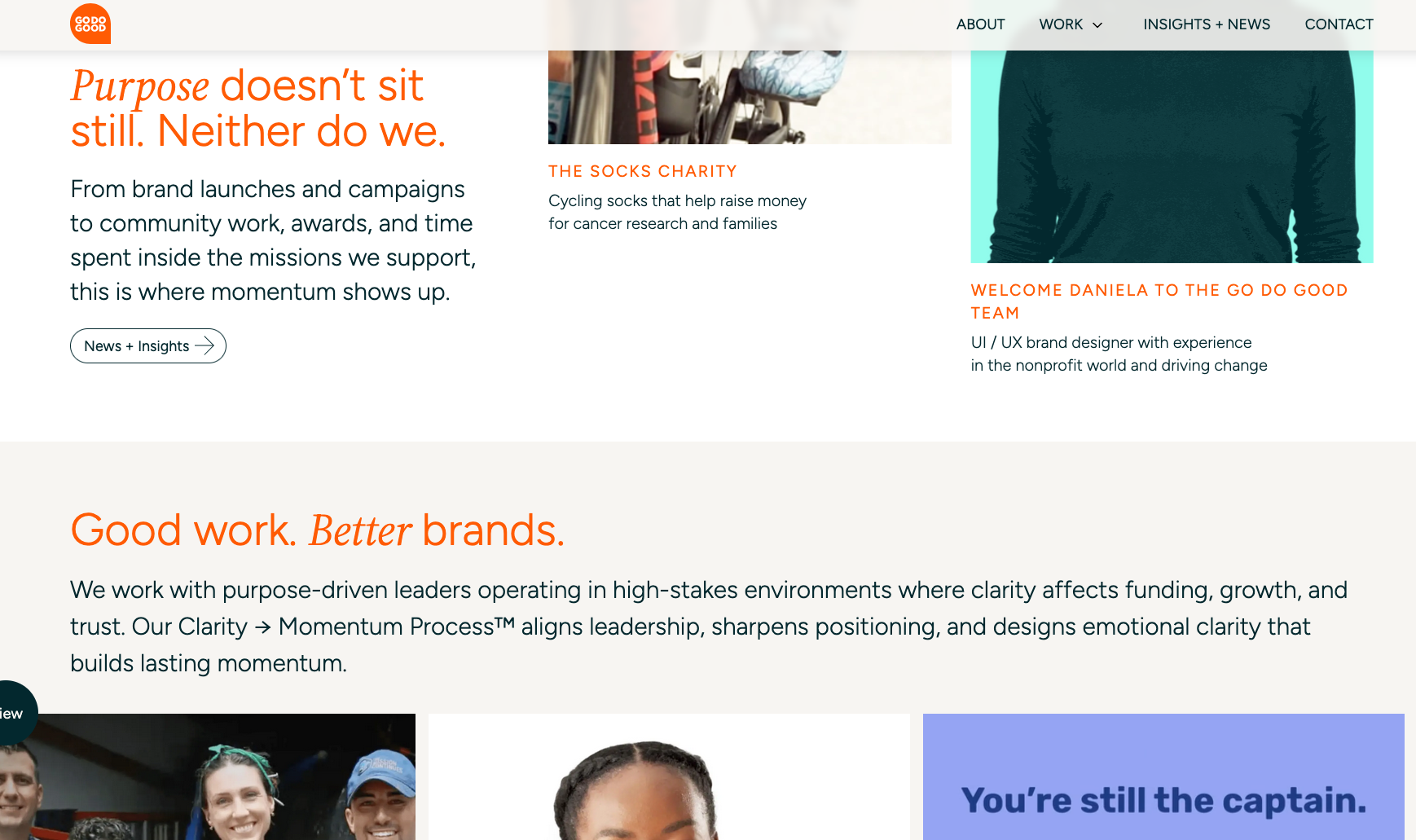
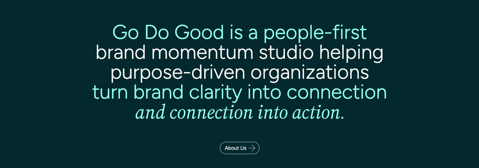

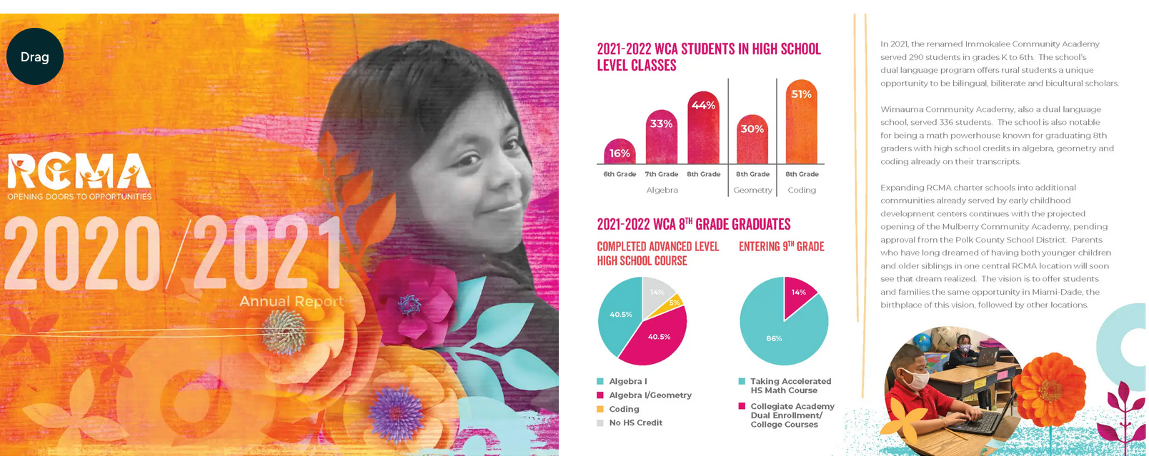
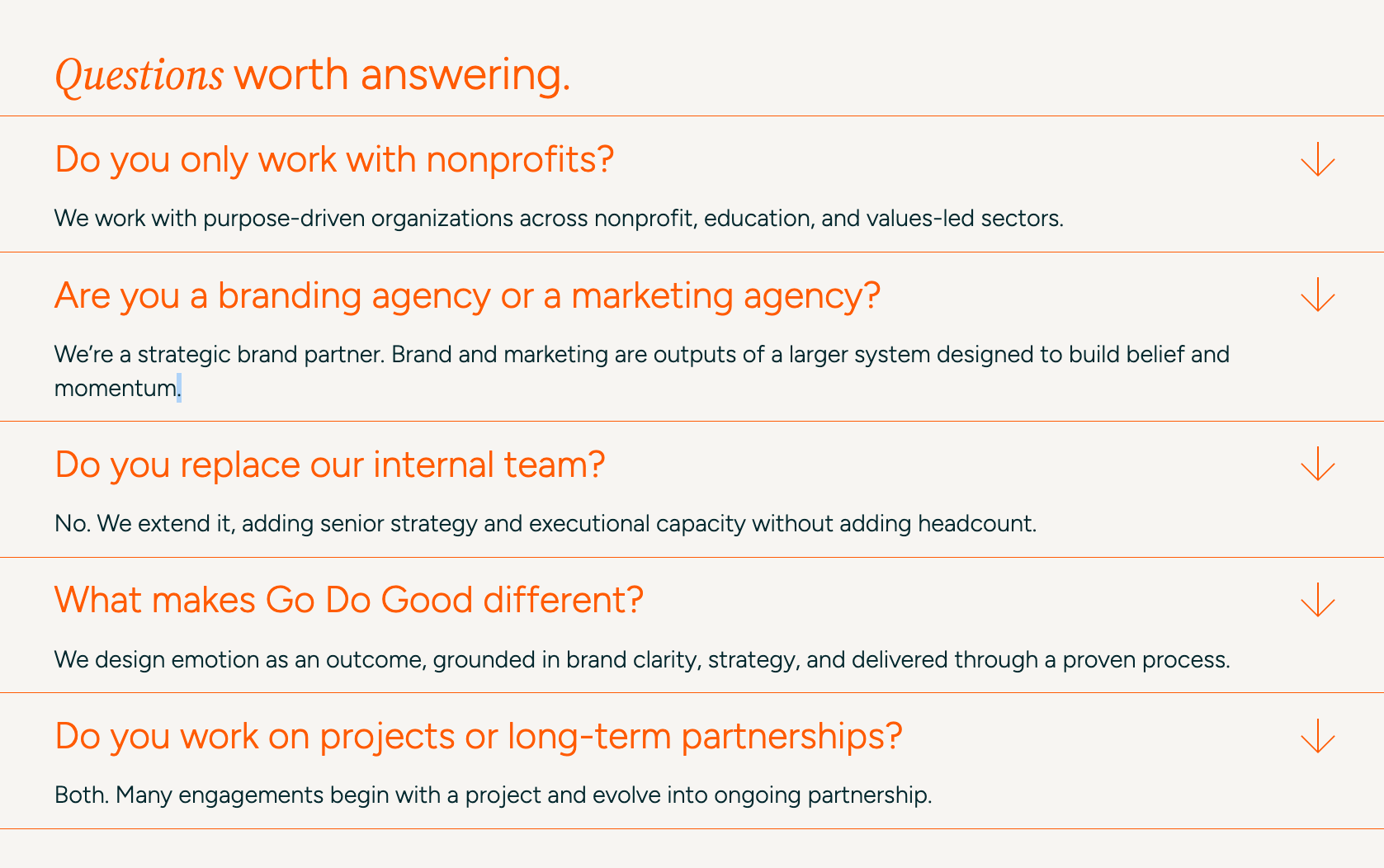
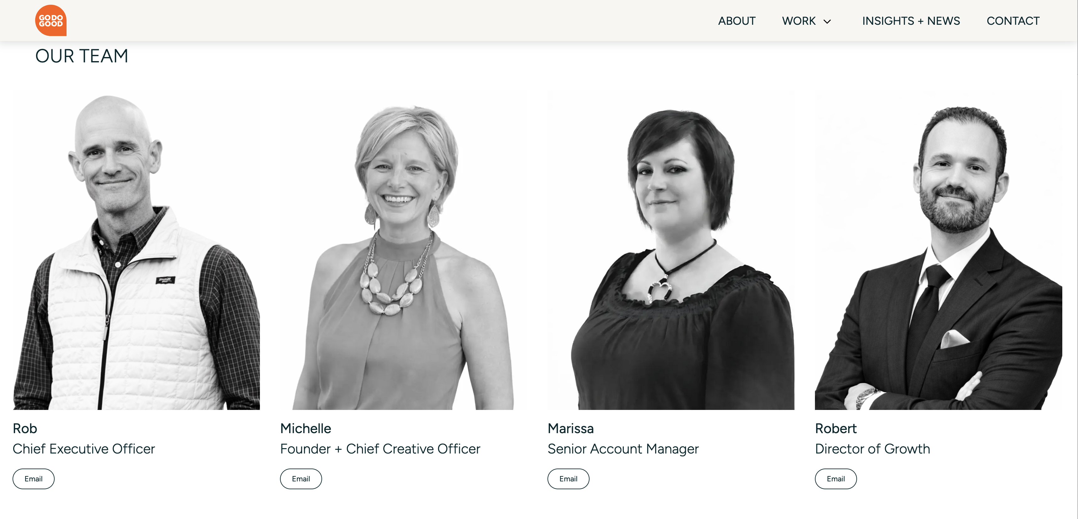
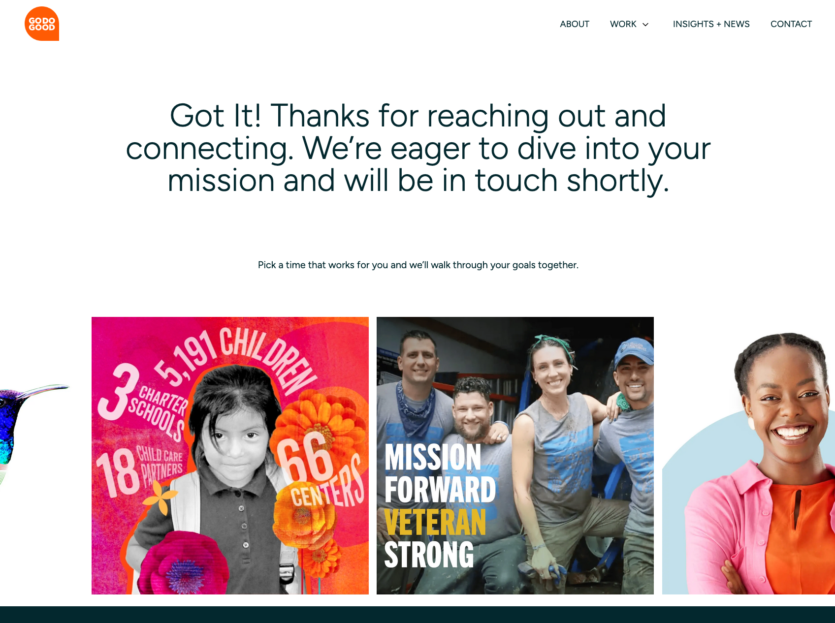

A suggested order of operations, from quick wins to bigger improvements.
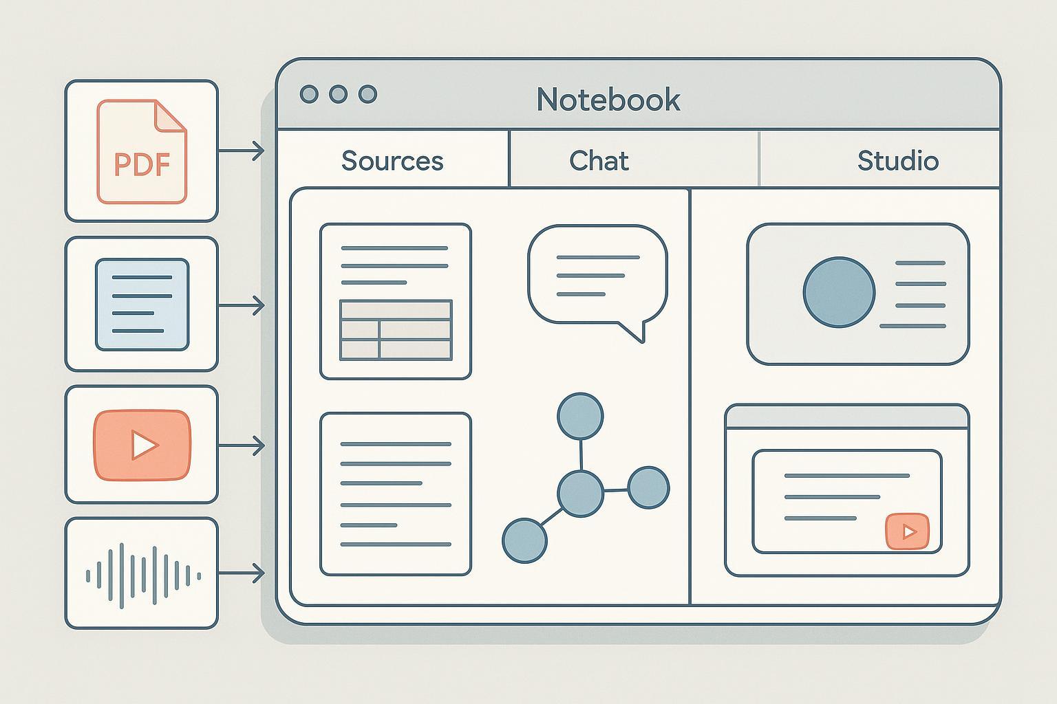
A powerful AI research tool that could transform how Go Do Good approaches content strategy, client onboarding, and brand research. Here's why it matters for your team.
Upload brand documents, competitor sites, and industry reports. NotebookLM synthesizes them into actionable content themes and messaging frameworks.
Feed in a prospect's existing materials and get instant brand audits, positioning gaps, and opportunity maps before the first meeting.
Analyze multiple sources simultaneously, surface patterns across documents, and generate briefings that would take hours to compile manually.
Generate podcast-style audio summaries of research findings to share with clients or use internally for team alignment on strategy.